Setting the stage
With the rebrand of Beam Dental to Beam Benefits and the redesign of the app underway, the design system was prime for an upgrade. I chose the visual direction and lead the execution of the new system.
Previous state
Systems-Wide
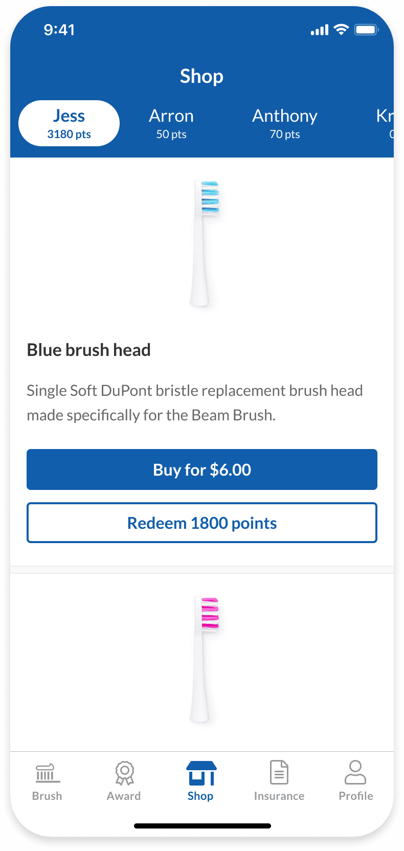
The previous system lacked consistency, with components changing slightly between pages and products. This included cards, buttons, and typography.
Aesthetic
The visuals were very heavy, leaning on our dark Beam Navy color and squared-off corners. The aethestic served to make Beam feel more professional, but it lost its personable charm along the way.
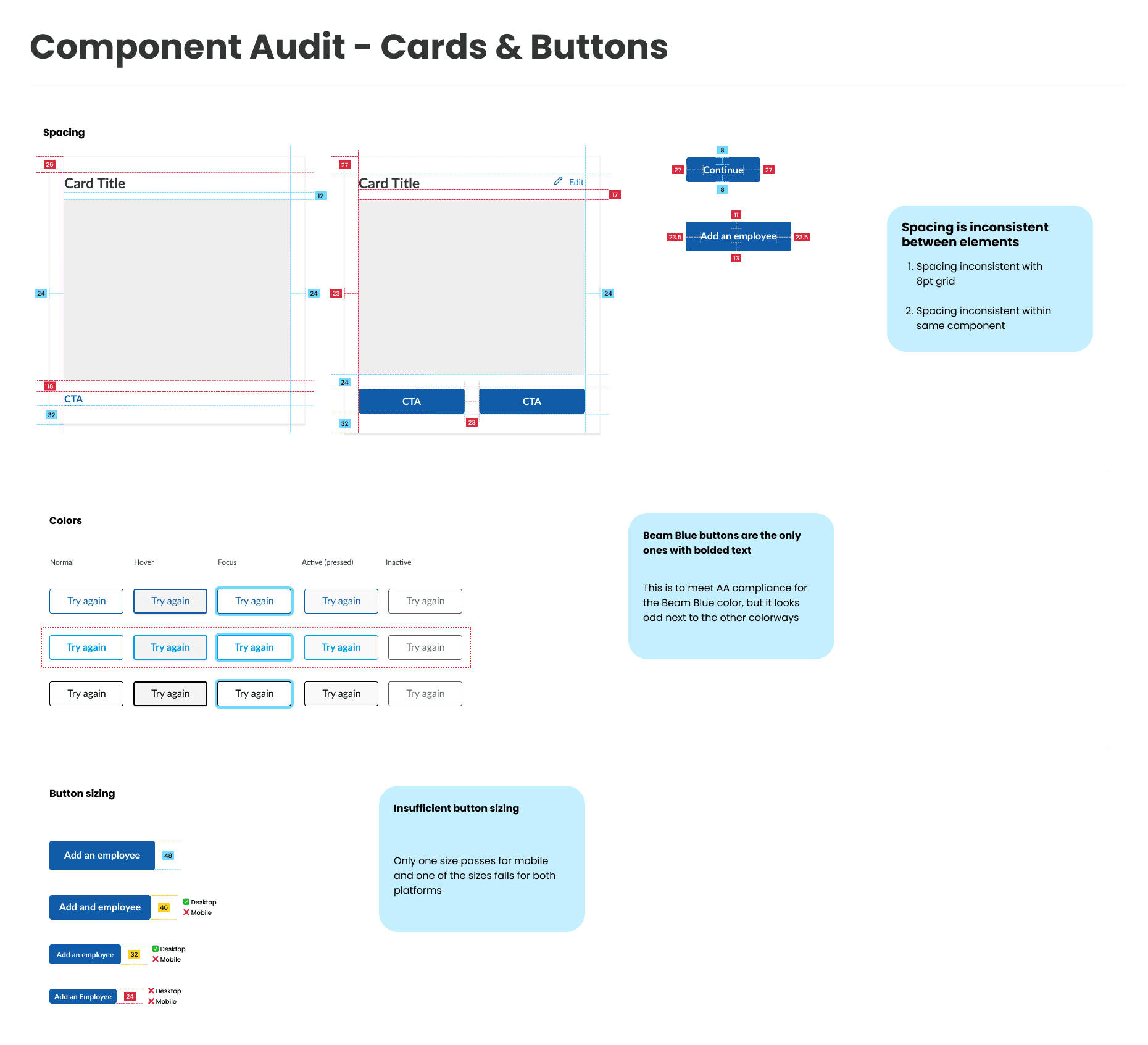
Audit
Buttons
Most button sizes are too small for mobile accessibility, with the biggest size being only 48px in height and the next biggest being only 40px in height. To meet WCAG accessibility, the minimum should be 40px. Font for Beam Blue buttons has to be bolded to meet accessibility, making it conflict with other buttons.
Cards
Card components varied in padding greatly, creating an incongruous look between products.
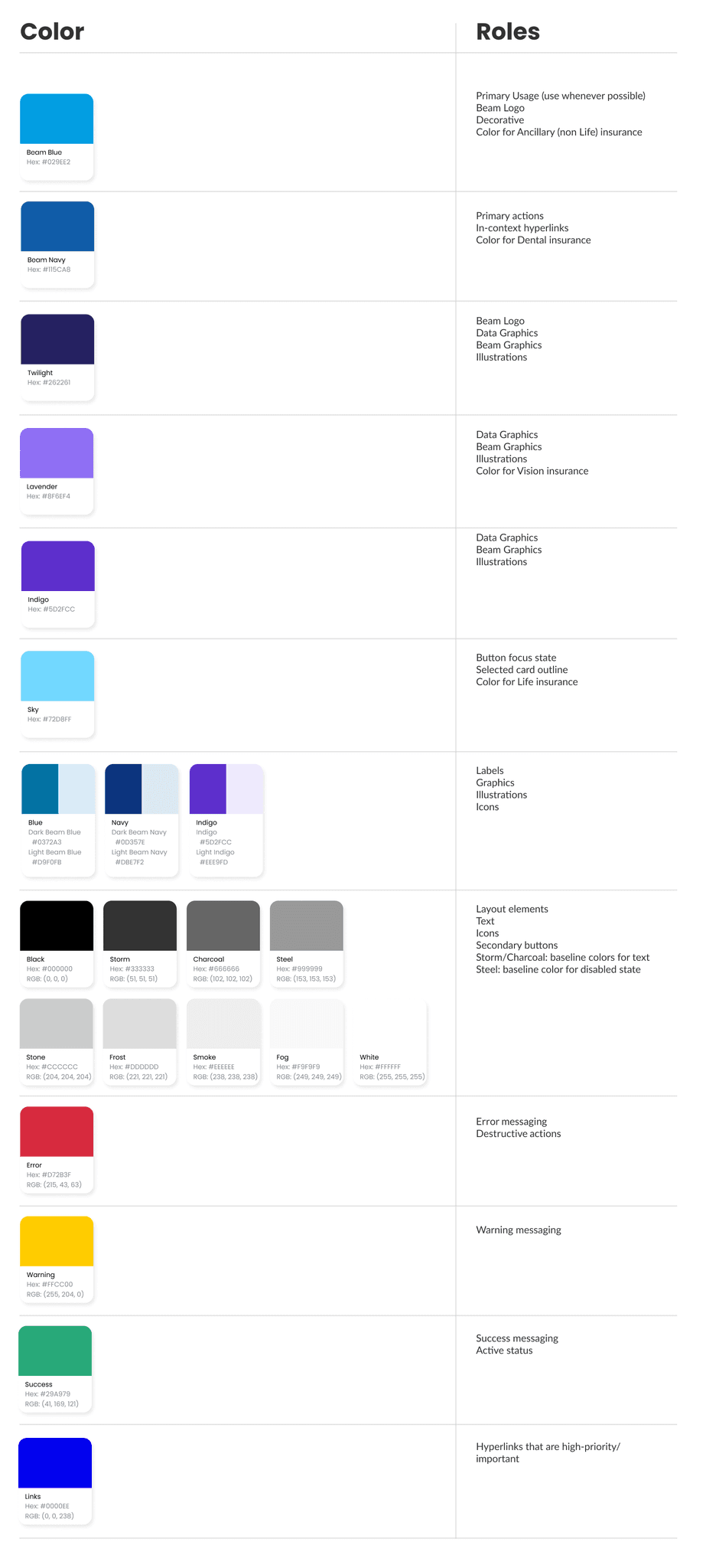
Color
The products leaned heavily into Beam Navy, with other colors only being used for tag components, products, or illustrations. This gave the product a very heavy and cold feel. It worked great for our broker tools, but felt too standoff-ish for our members wanting an approachable and welcoming experience. We also had an issue of using too small of font on our Beam Blue elements to meet WCAG standards. Beam Blue font would also be the only font bolded on secondary buttons, creating an odd look.
Layout
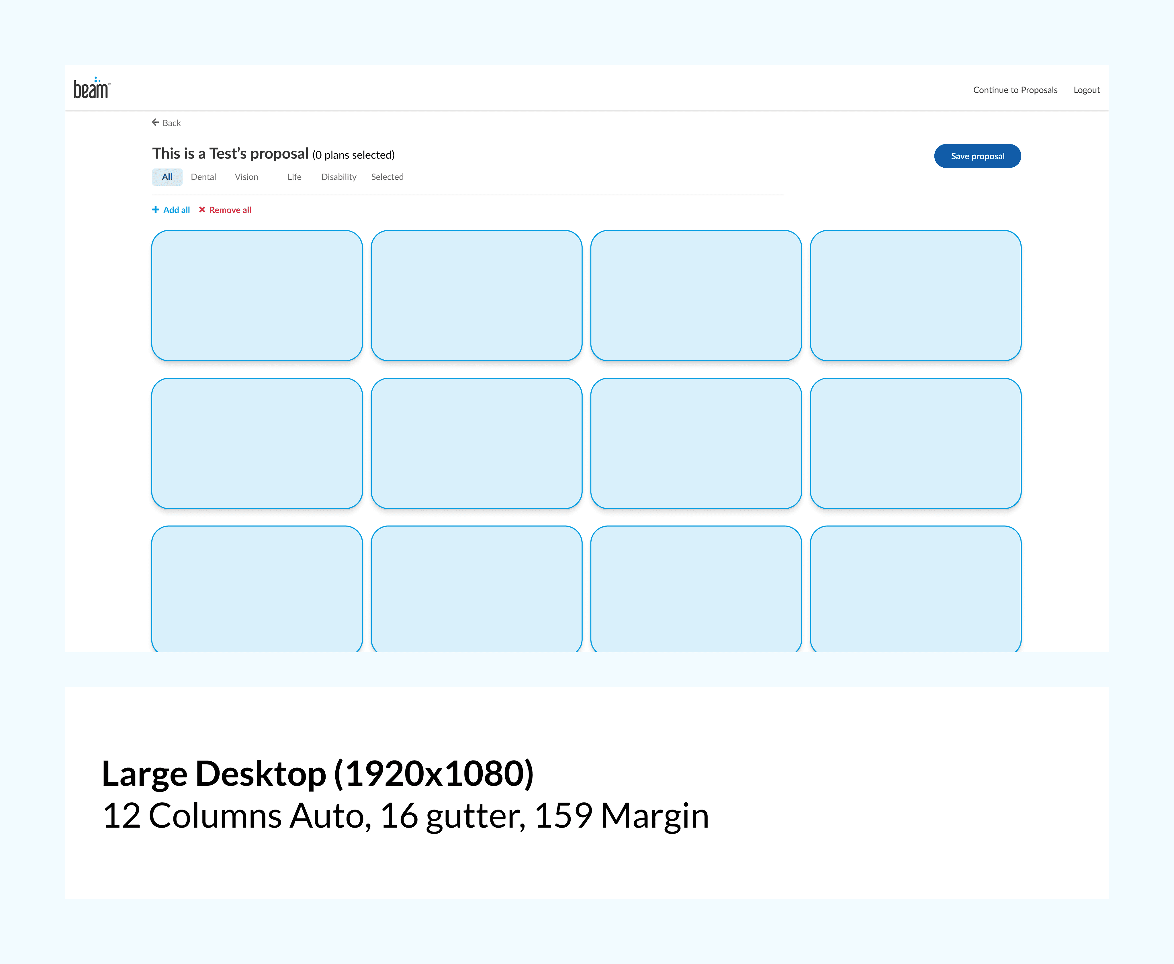
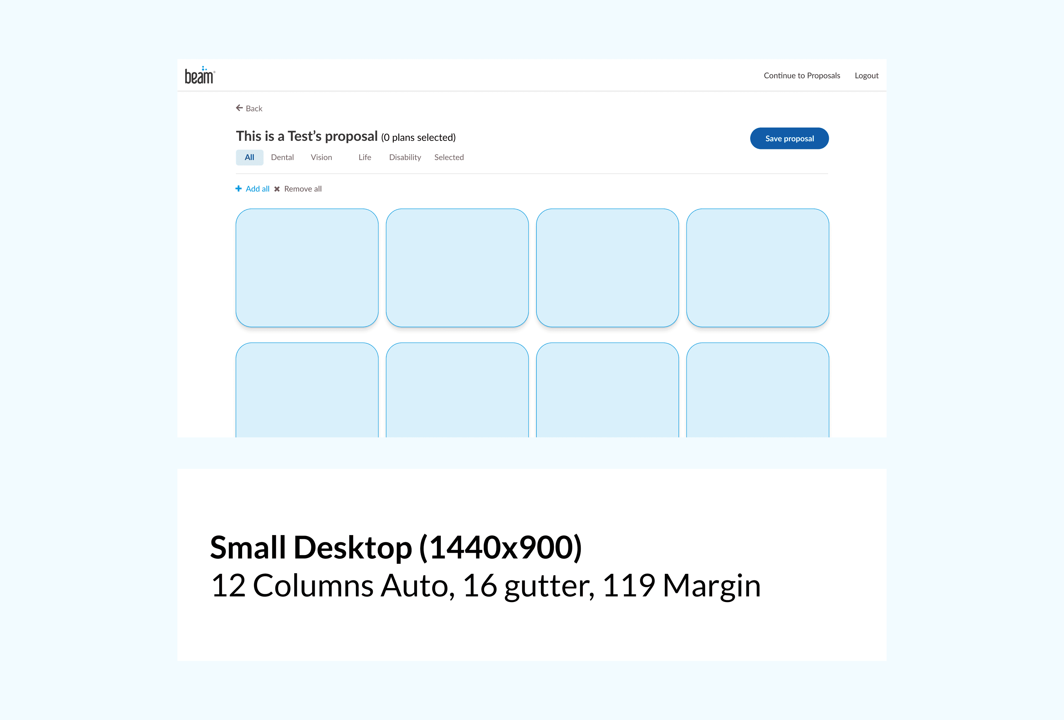
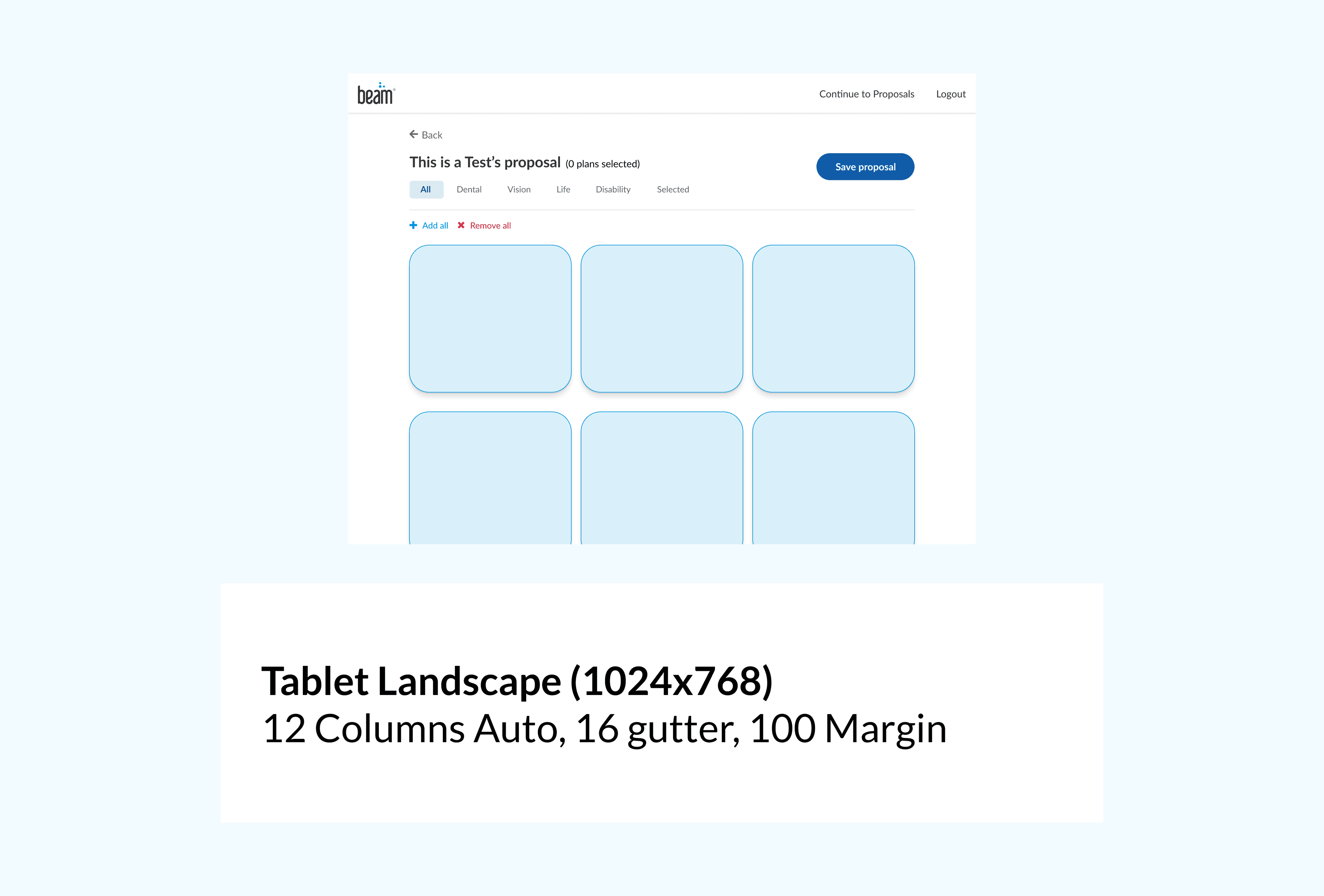
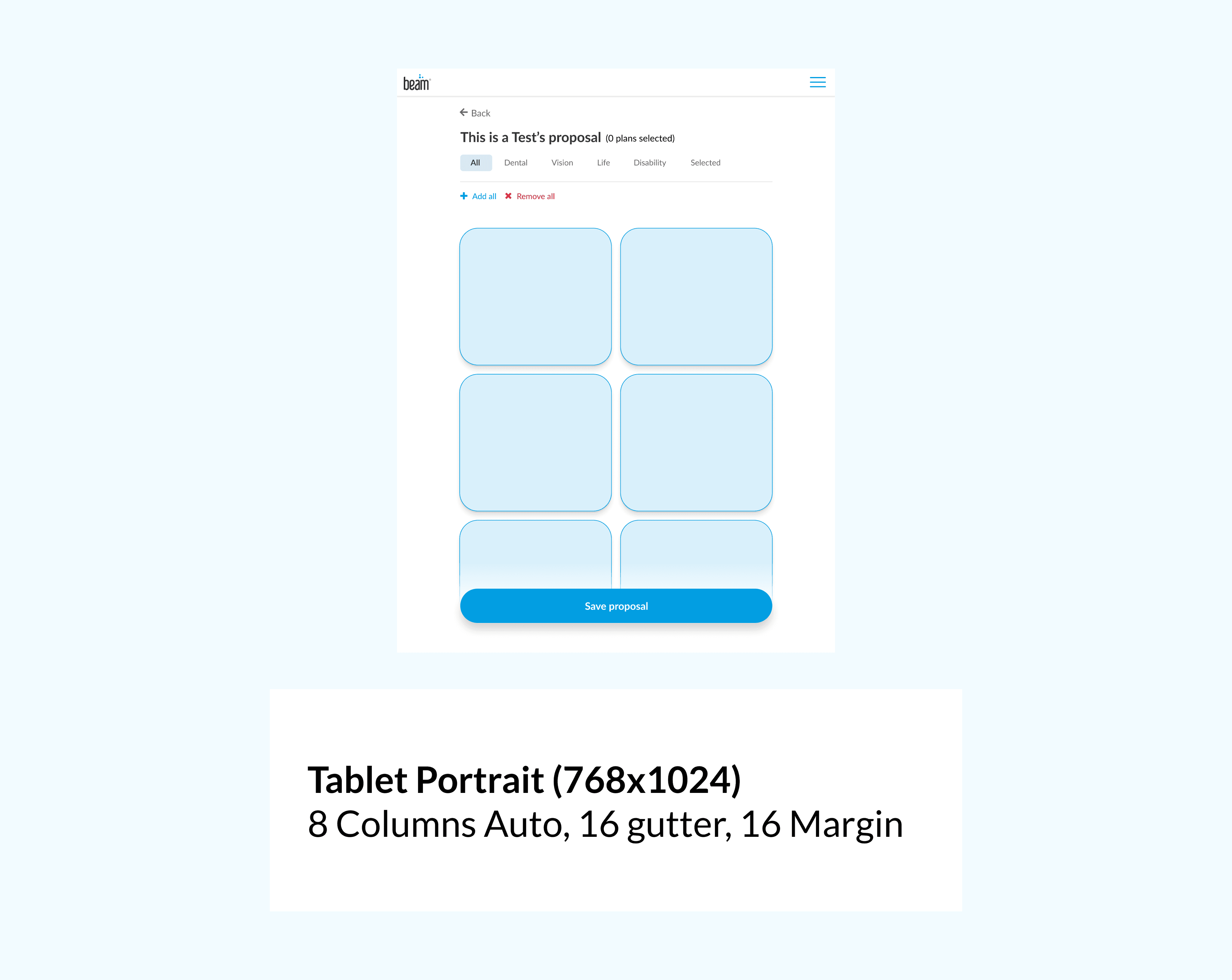
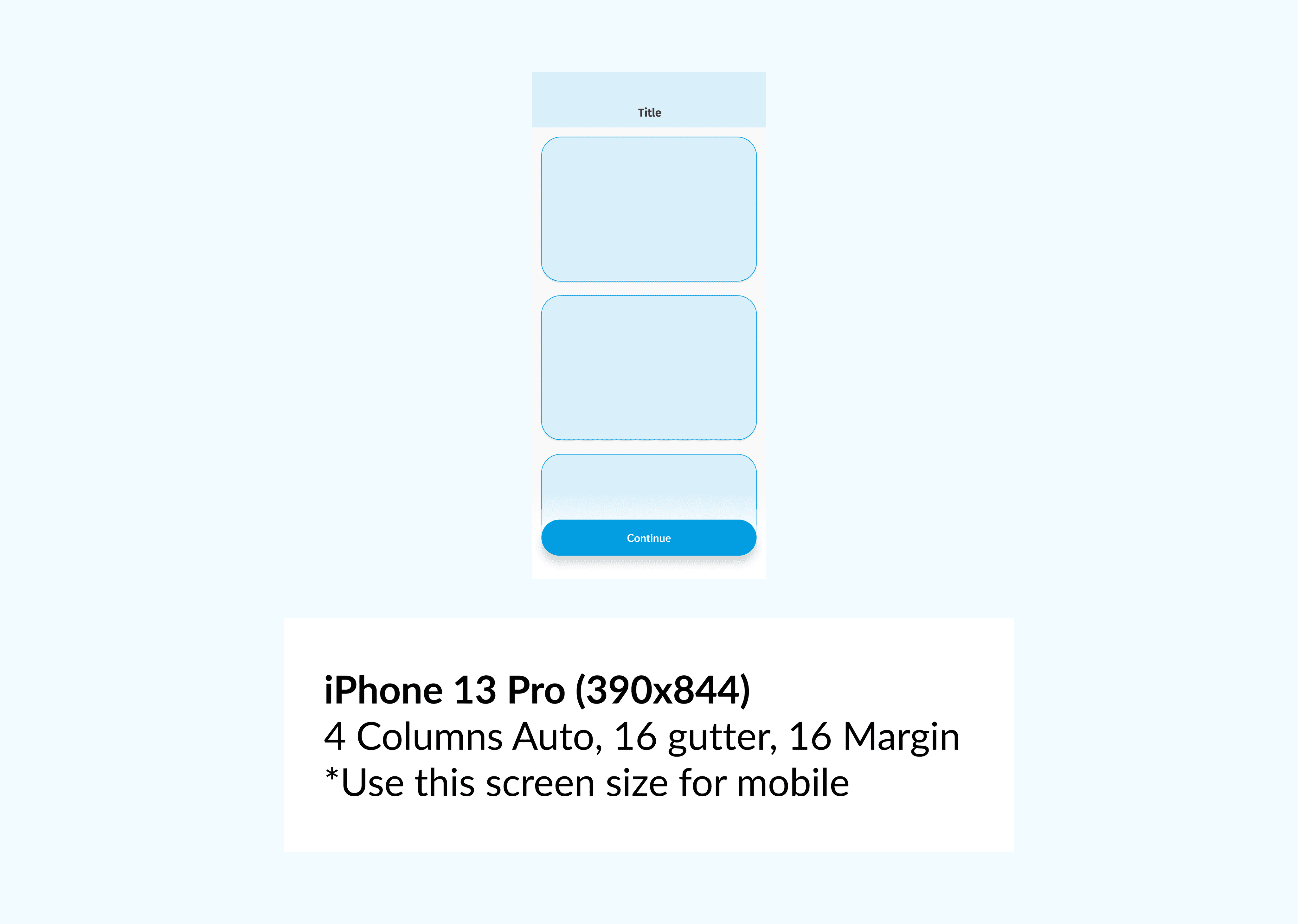
Designs didn't follow a persistant column layout, making elements feel out of place and off-balance between pages and with each other.
The new direction
I focused the redesign on four principles. This would guide both the new aesthetic direction and the philosophy of how our product designers would build features for our users:
Prove the Value
We respect people’s time by creating products that have a specific utility, which aligns with the core functionality of our business.
Assure and Ensure
Our products must instill confidence that Beam is trustworthy, legitimate, and reliable.
Charity is Key
Insurance is complex. We present information in a way that is transparent and easy to understand.
Beam On!
Our products highlight Beam’s unique identity as a fun, friendly, and modern benefits company.
While the first 3 focused on the user experience of the product, the last focused on the unifying aesthetic of the new direction.
Foundations
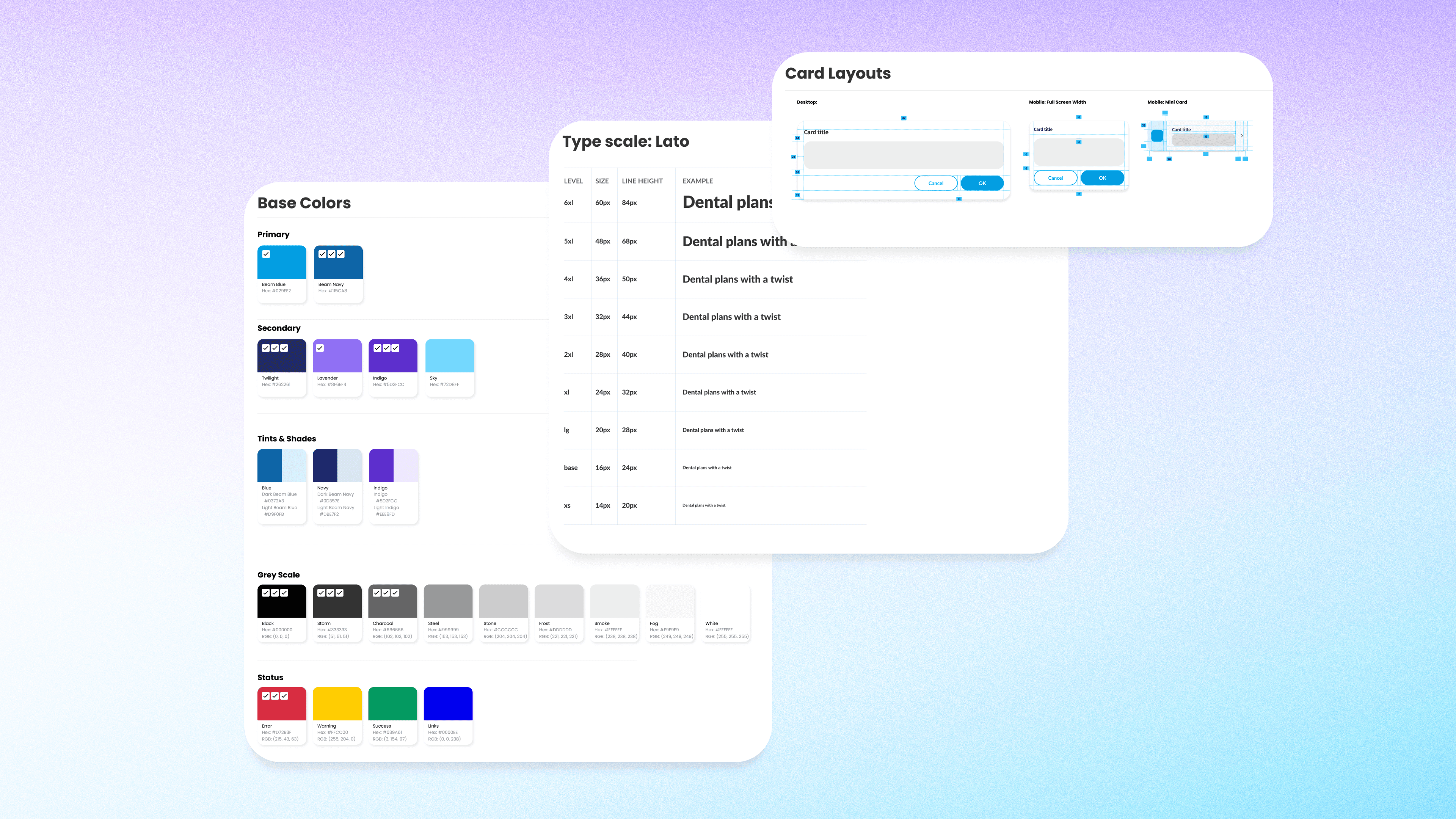
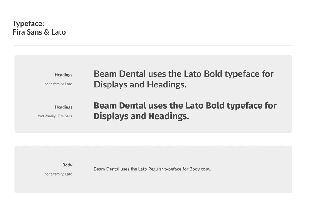
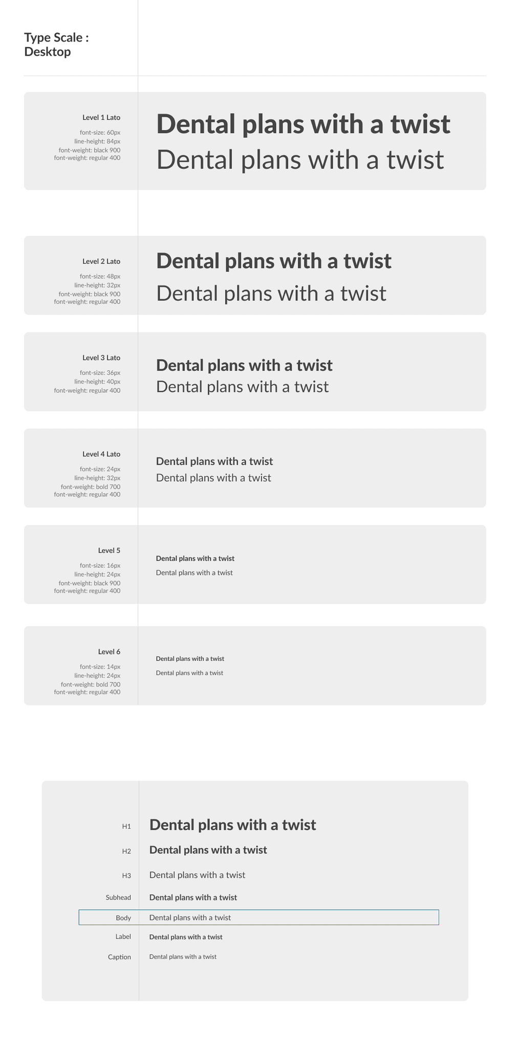
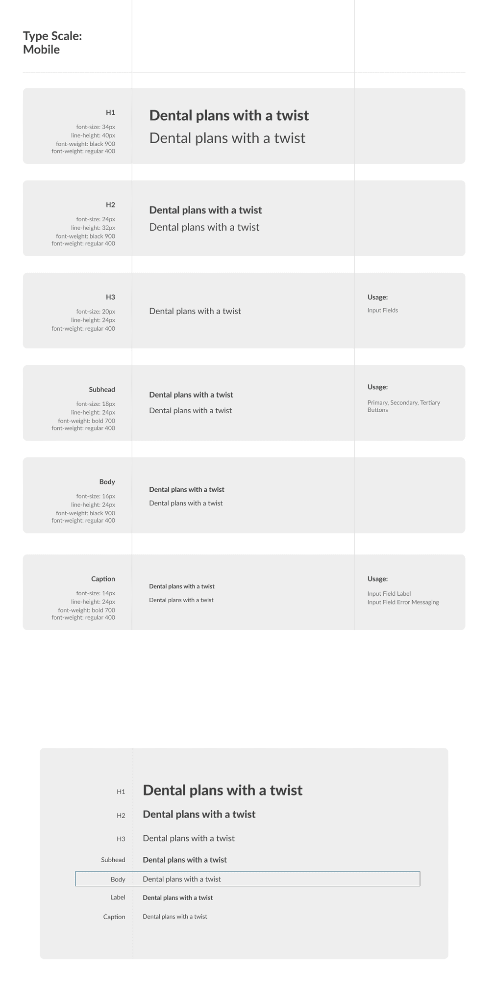
Typography
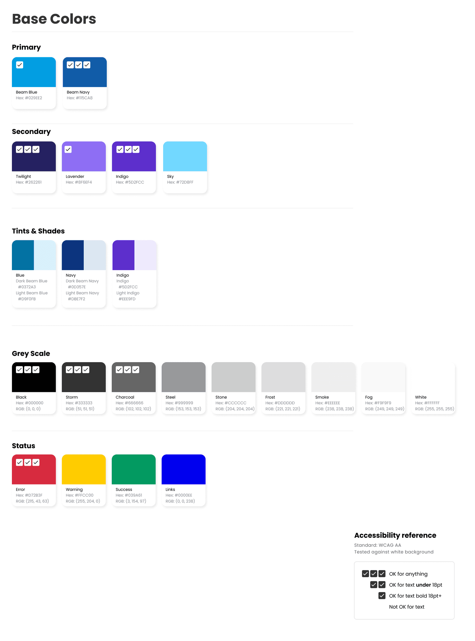
Color

Layout