
Setting the stage
HealthJoy is a benefits navigation platform
It centralizes employees insurance, ancillary benefits, and other employee perks all in one mobile app. By engaging in the services HealthJoy offered, employees saved money and employers purchasing HealthJoy reduced costs.
Previous state
67% of onboarded members in January 2024 did not use any services offered in-app. This created an issue: they would check their benefits cards, but not much else. A substantial part of the cohort stopped opening the app altogether by September. In this redesign, I owned the login screen, benefits explainer, and personalized plan.
Login
Benefits Explainer
Health Goals Intro
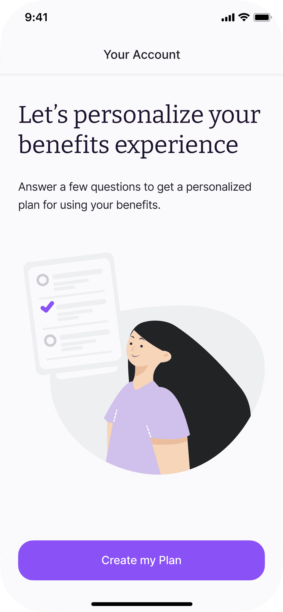
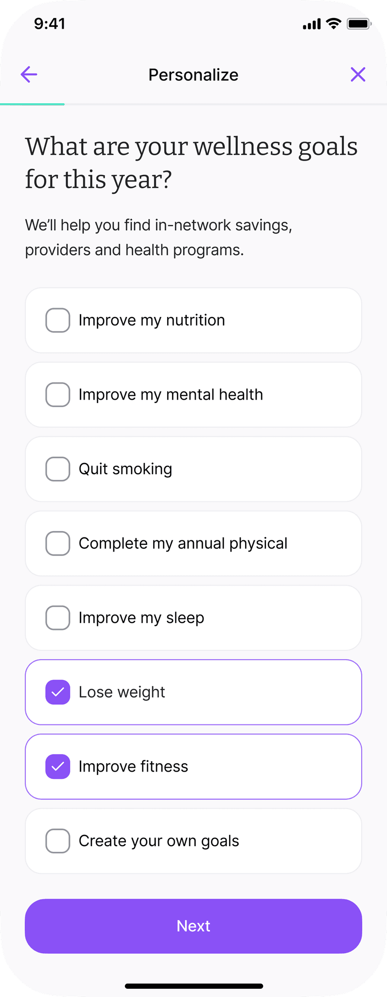
Health Goals
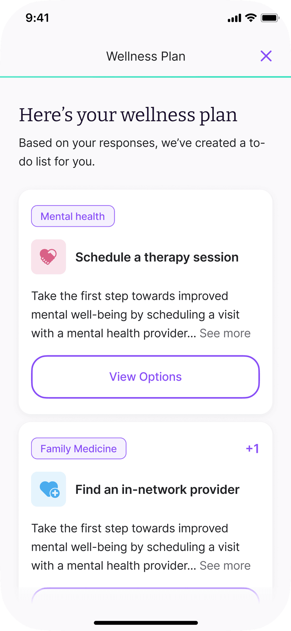
Personalized Plan
What we knew
There was hope: the 33% who did interact beyond viewing their benefits, such as through using the Find Care feature or Teladoc for example, were highly retentive. Our hypothesis: given members did not shop for this service themselves, they did not understand HealthJoy's value during onboarding.
Personalization needed refinement
Users who completed their health goals and received their personalized plan during onboarding are highly retentive. However, there's an inverse relationship between amount of personalized plan cards, such as "Schedule a therapy session" and interaction; the more cards, the less likely the user will interact with any particular one.
Research findings
Users wanted to understand their new coverage, check network status, and be visually engaged
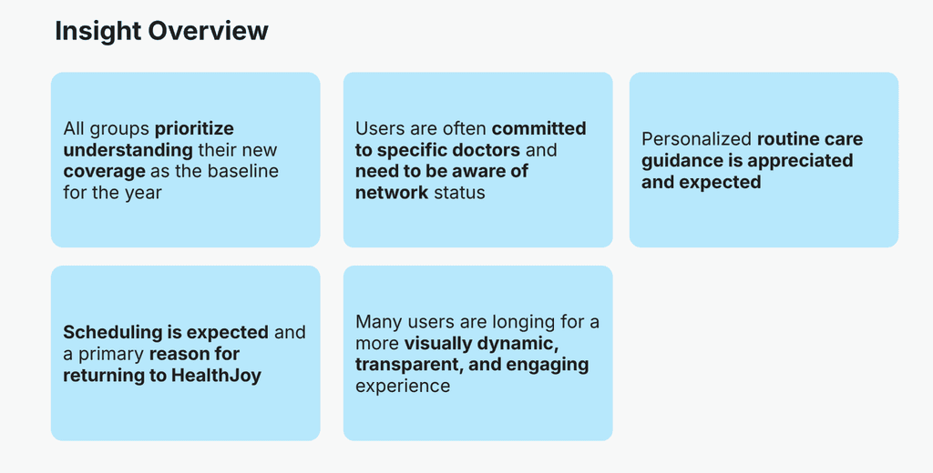
Insight slide from co-designer and researcher Kristen' McIntyre's presentation
Balancing Personalization and Cost Reduction
Users who completed their health goals and received their personalized plan during onboarding are highly retentive. Their answers also provide their employer key insights on the health of their employees. However, there's an inverse relationship between amount of personalized plan cards, such as "Schedule a therapy session" and interaction; the more cards, the less likely the user will interact with any particular one. Users interacting with these features and staying in network is how employers save money.
Goals
Show HealthJoy's Value
Balance Information Overload
Present concepts in-depth and accessibly
Increase interaction
Change UX/UI to be more intuitive and visually engaging
Wireframes
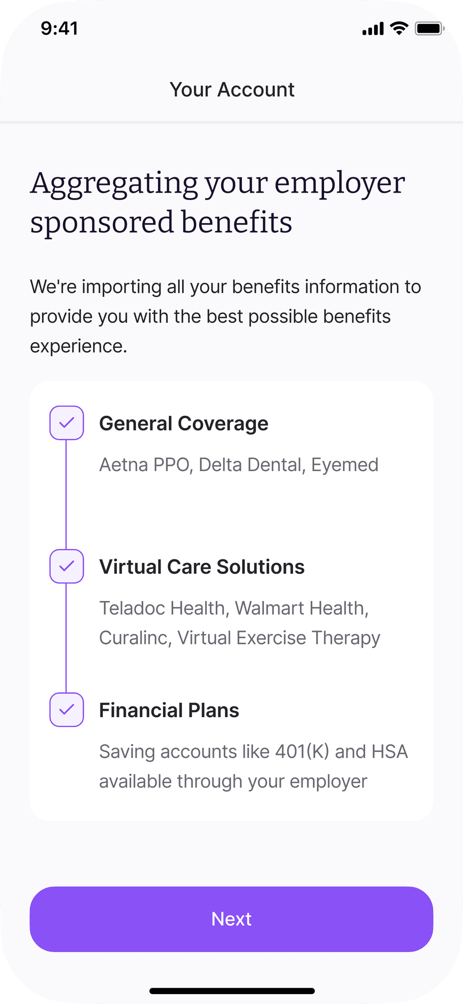
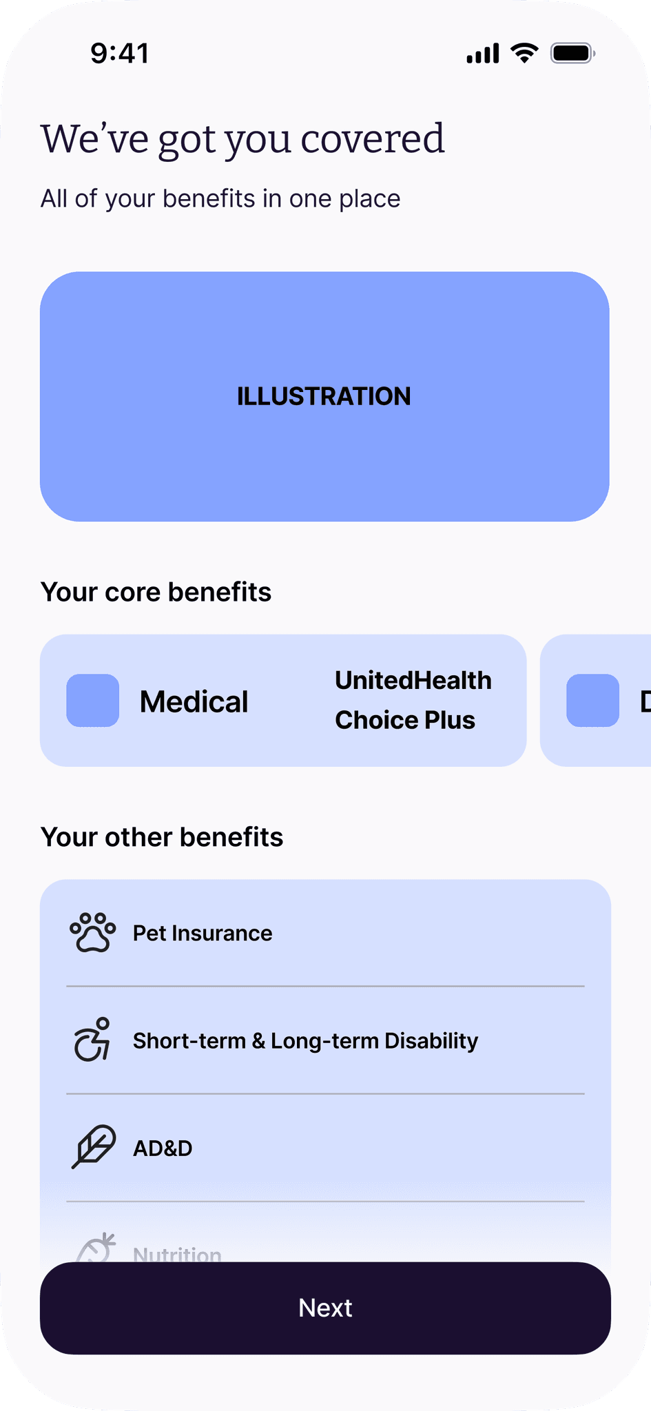
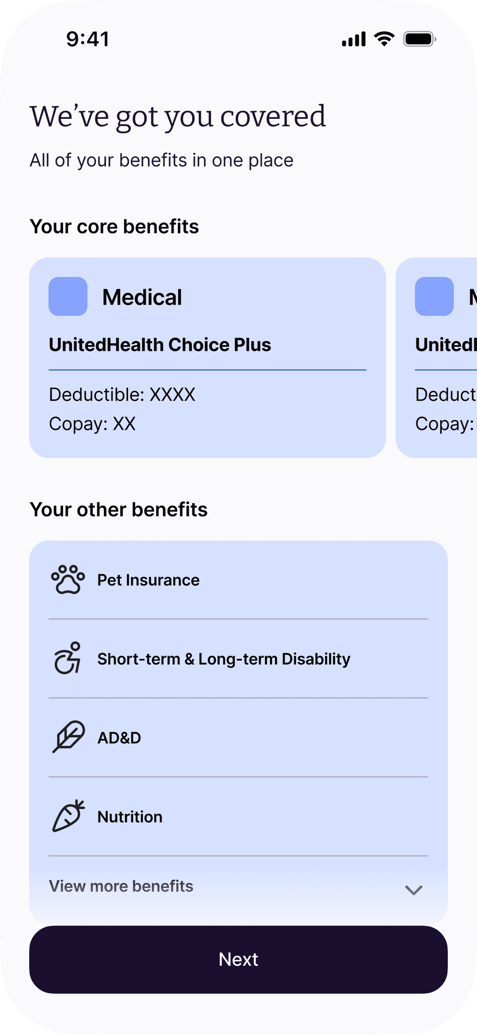
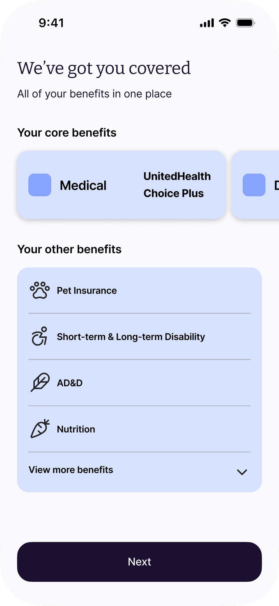
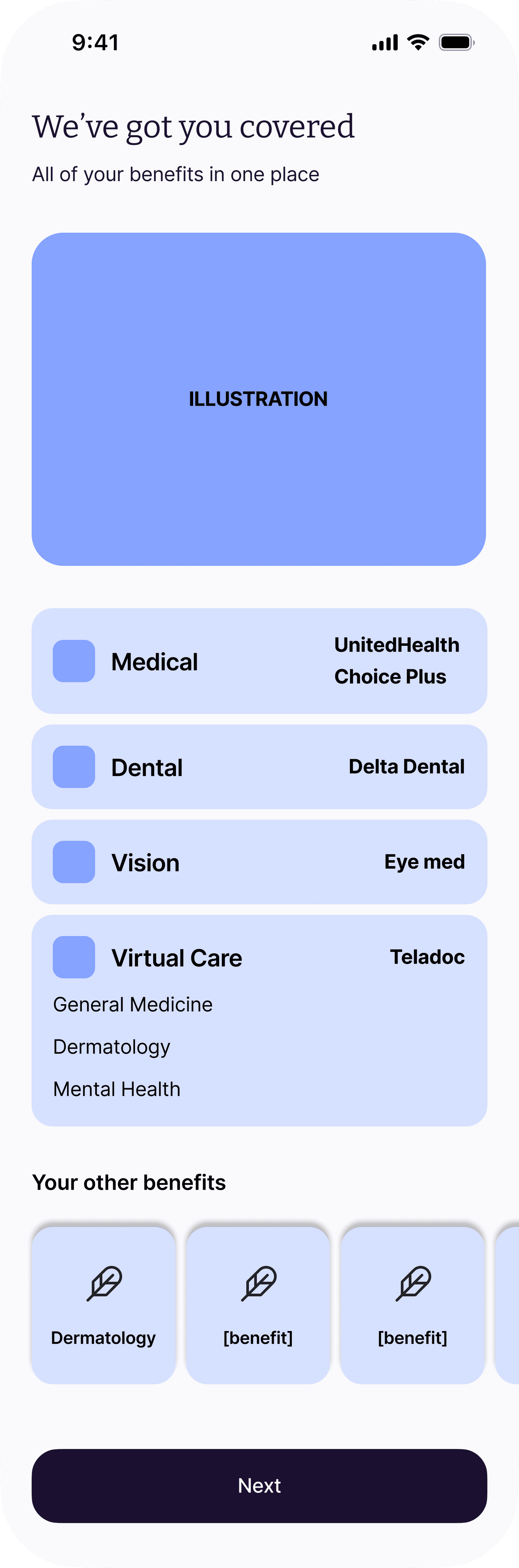
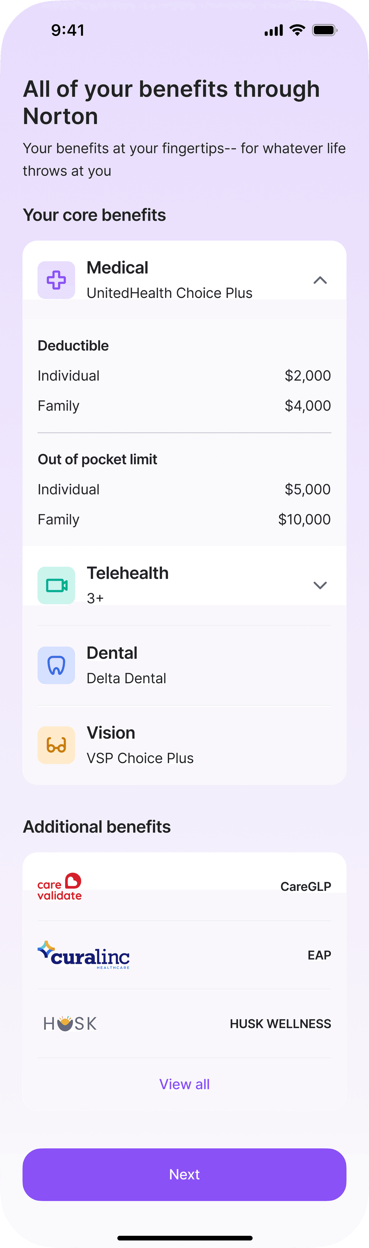
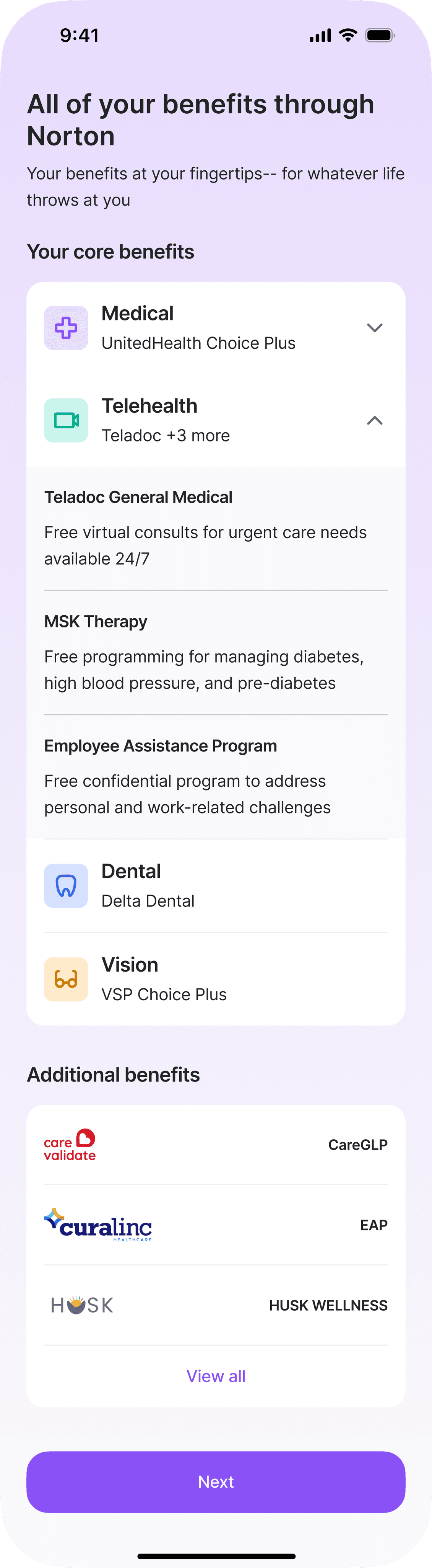
Benefits explainer screen
Designing this screen posed an interesting challenge. I wanted to have more information on the user's benefits, like their exact ID number, in this design. However, it wasn't technically feasible; most new employees or employees changing their plan won't have their full insurance information during onboarding until at least 1–2 weeks after the plan starts. I worked with the development team to figure out what information could be shared.
LoFis
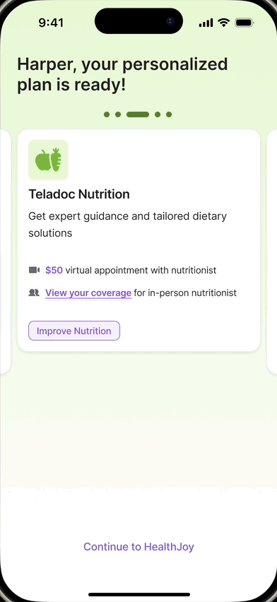
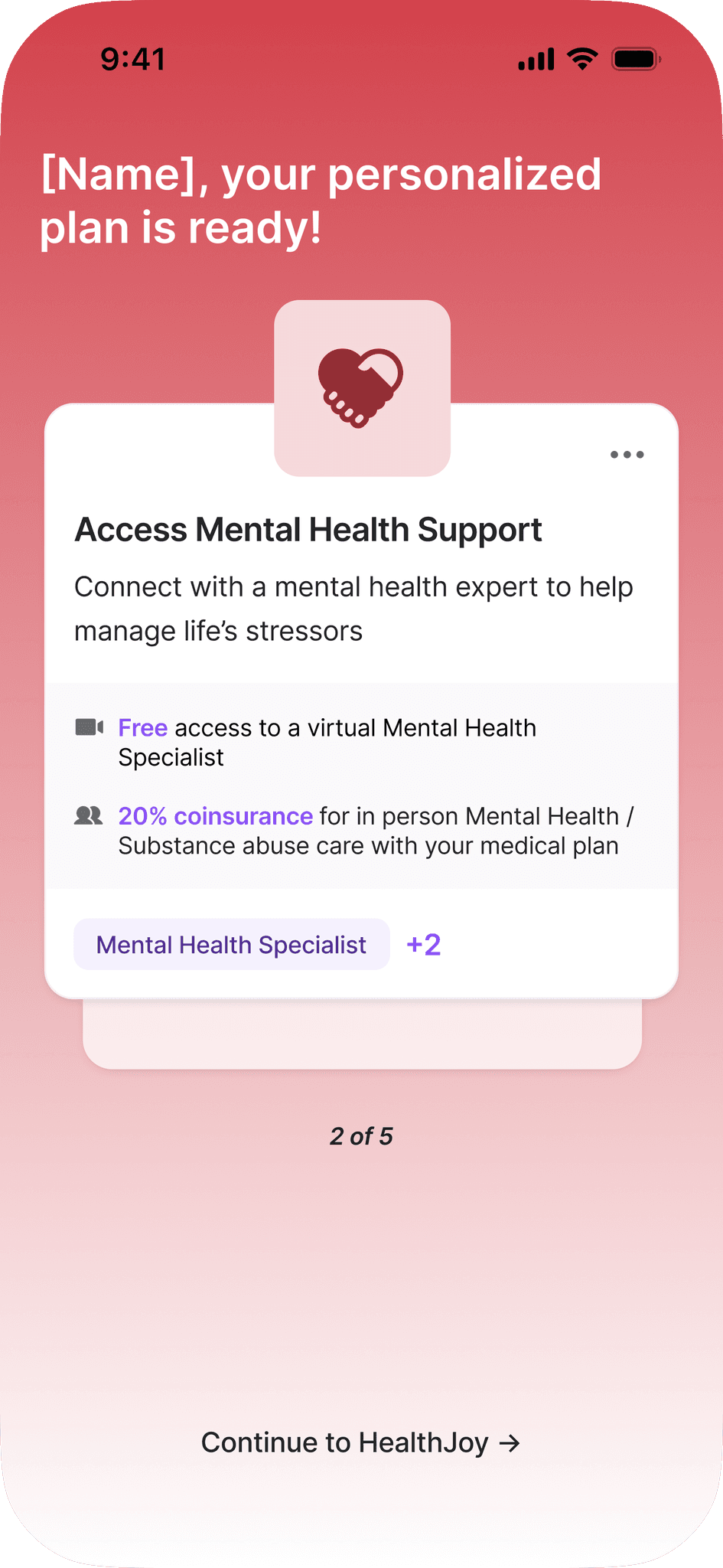
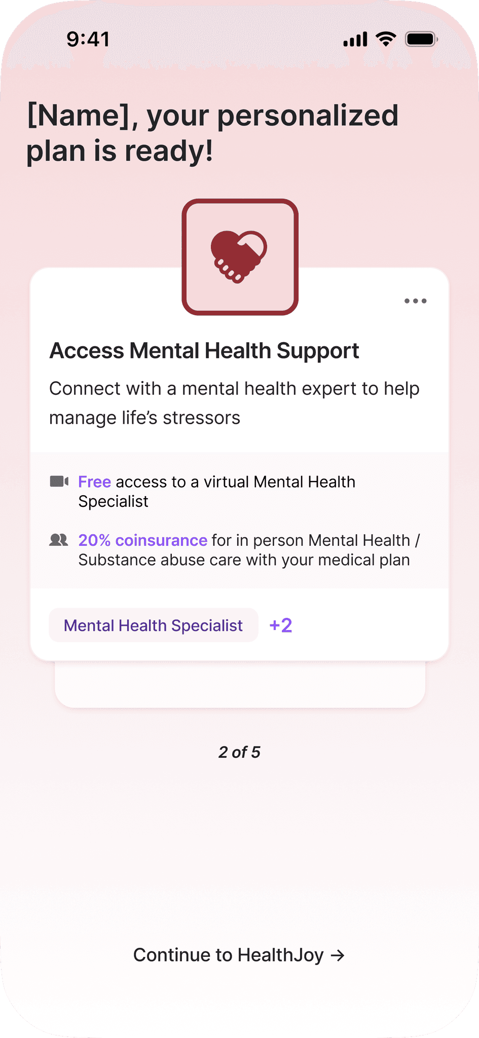
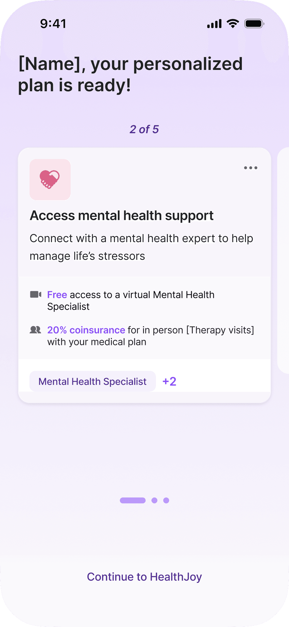
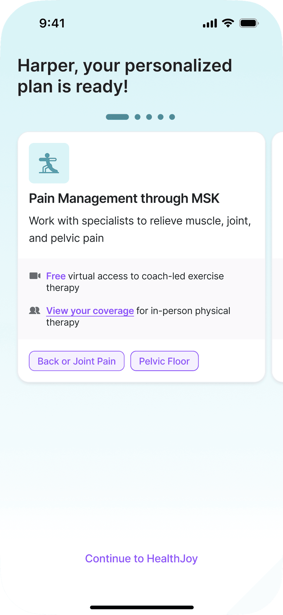
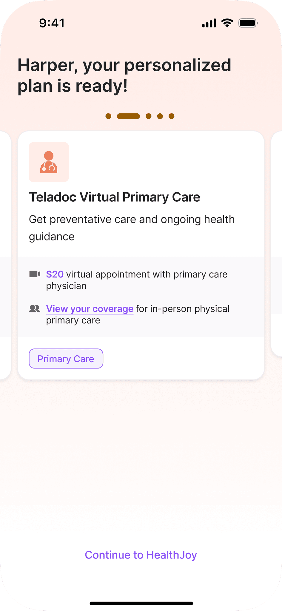
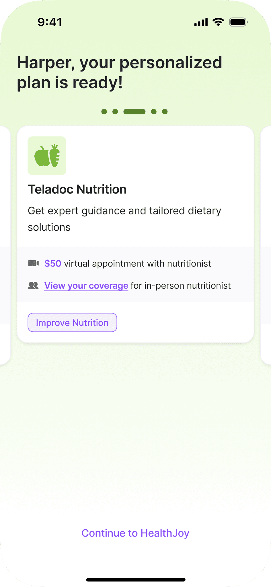
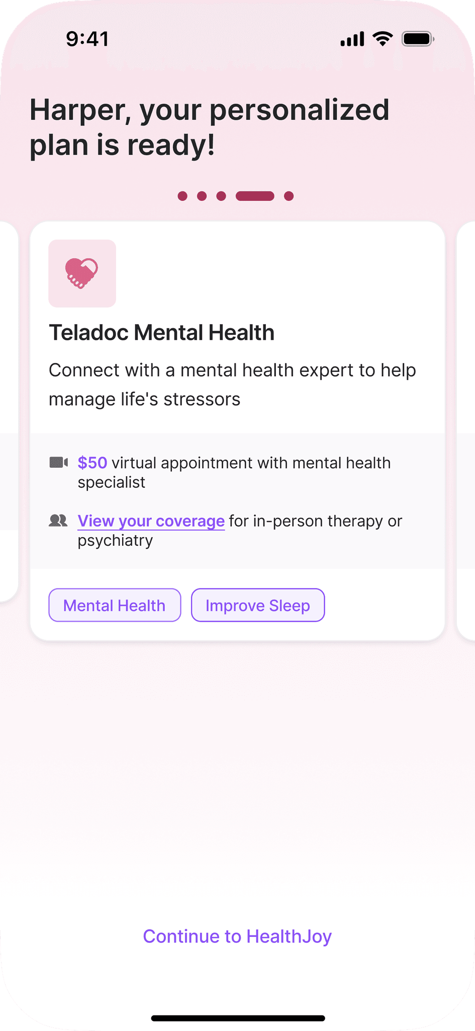
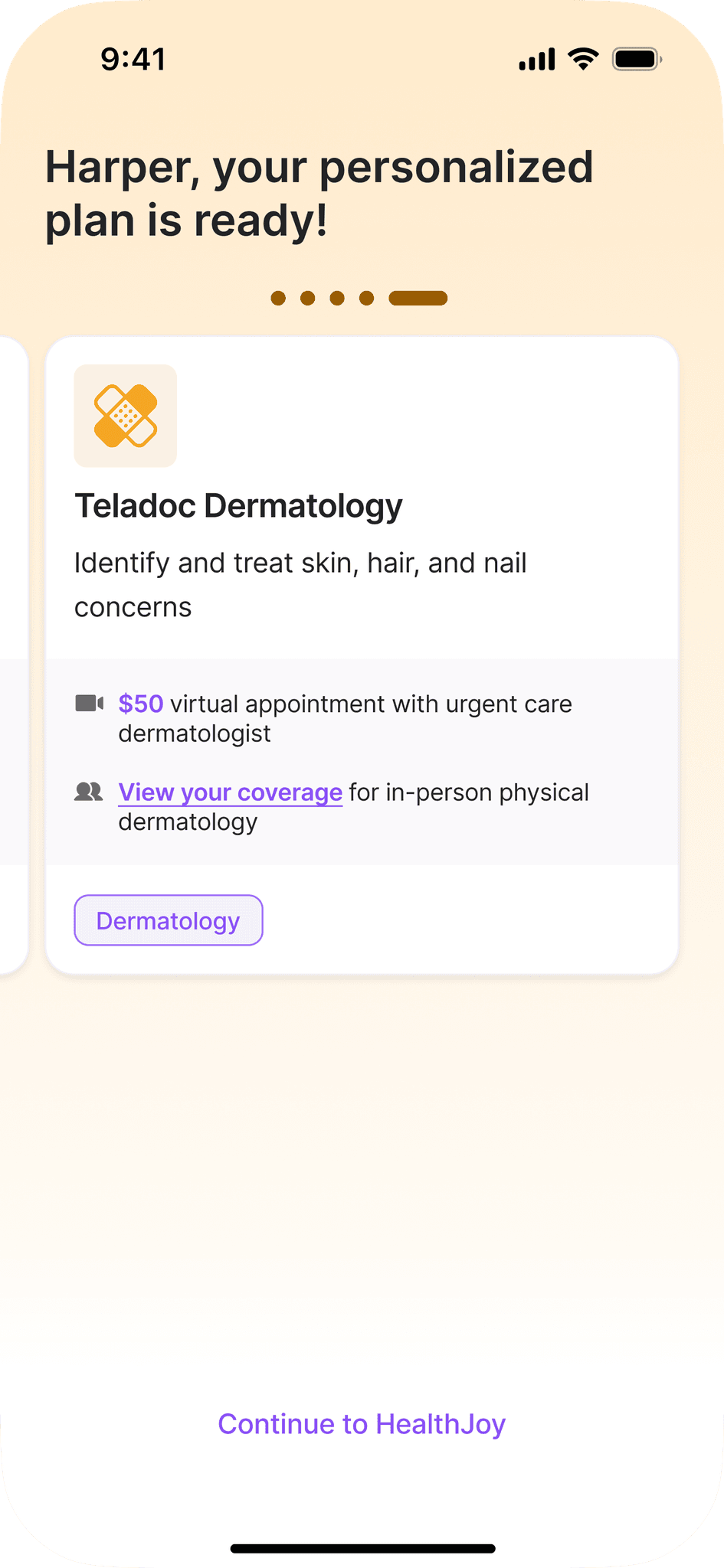
Personalized plan
The Product Manager, the co-designer, and I wanted to A/B Test our current list view of the Personalized Plan and a single plan item view. The hypothesis: showing one item at a time would be less likely to overwhelm and more likely to encourage engagement. I wanted to go with a more enticing visual design, but had to scale back for V0 due to time.

Final Designs
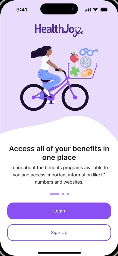
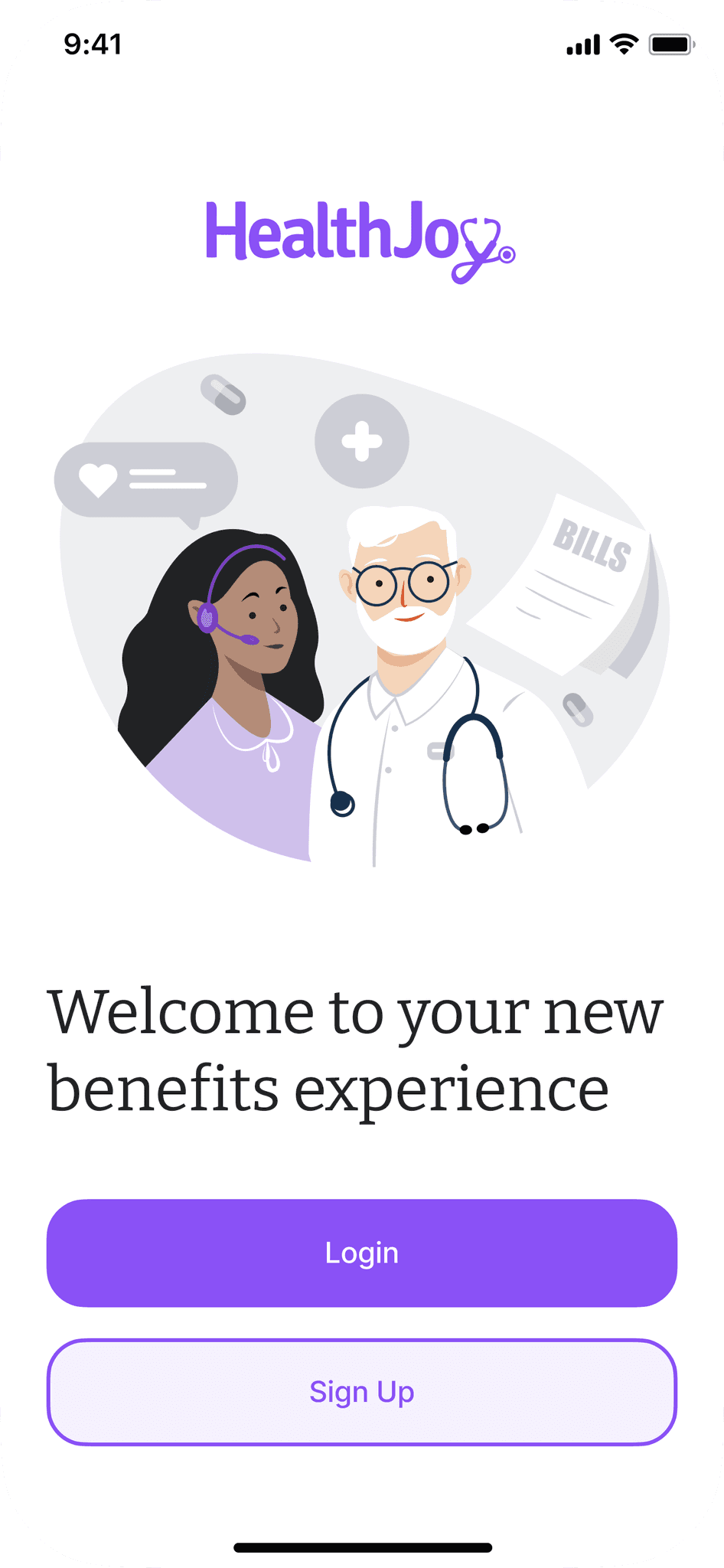
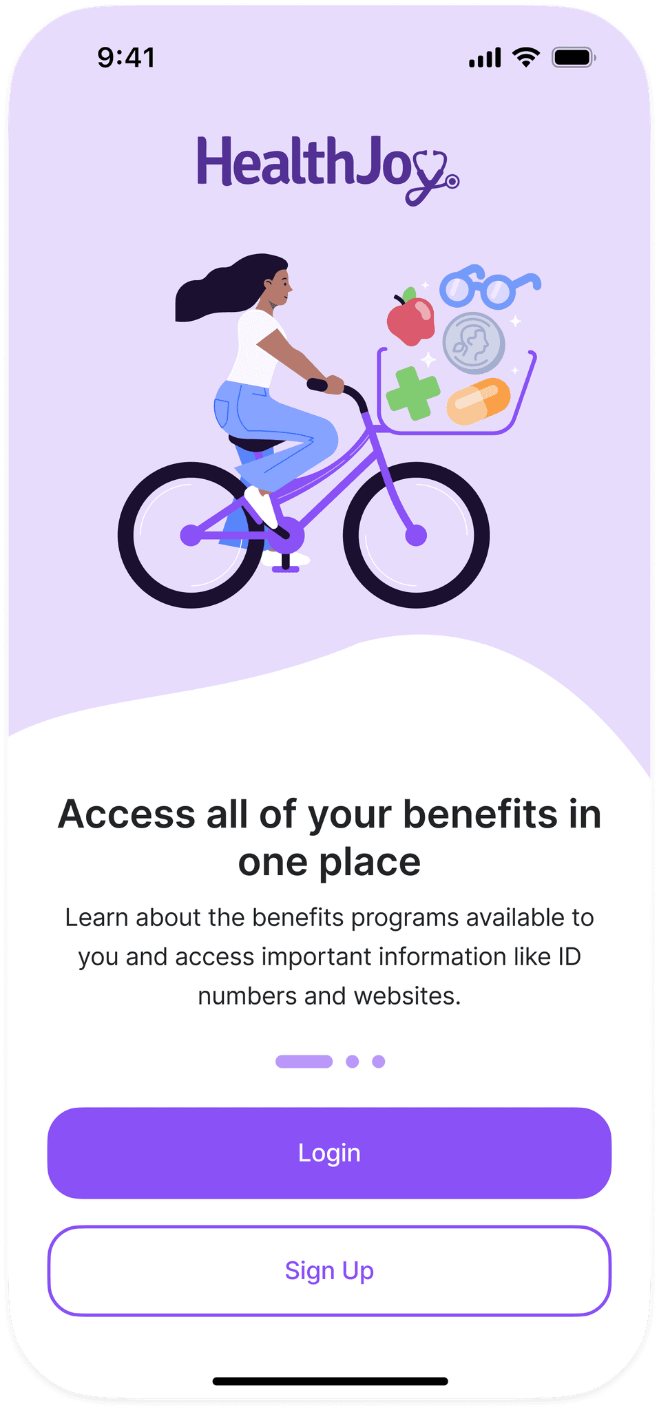
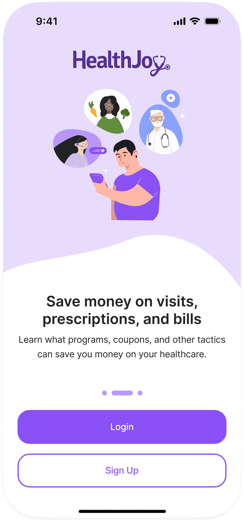
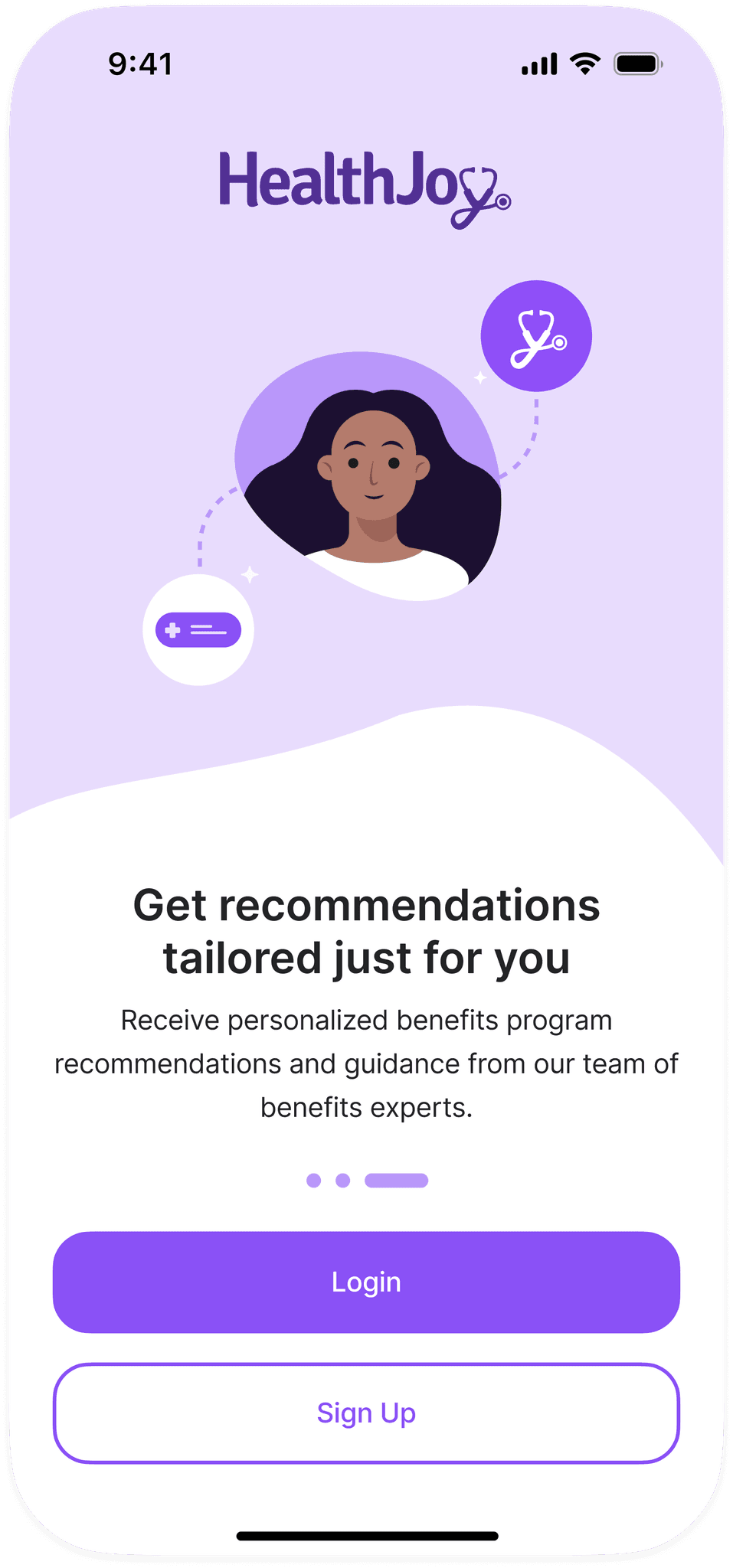
Log-in screens
I created new illustrations for the log-in screens. I added a carousel: each page explains HealthJoy's main benefits to the user. I also added color and shape to create a more visually engaging experience.
Benefits explainer screen

Personalized Plan
Impact
The new onboarding experience launched 7/1/2025.
The initial findings are promising. We found that the optimizations reduced onboarding time by 5% within the first month. However, we won't be able to evaluate retention until we gather more usage data over a longer period of time.
